Not your usual gallery... Roca London Gallery

Whether you are local in London, or just a passerby, make sure you have Roca London Gallery on your list!

Roca’ is a global bathroom brand, and its galleries around the world are each unique and designed by the city’s best Architectural designer, and in London, that has to be Zaha Hadid.

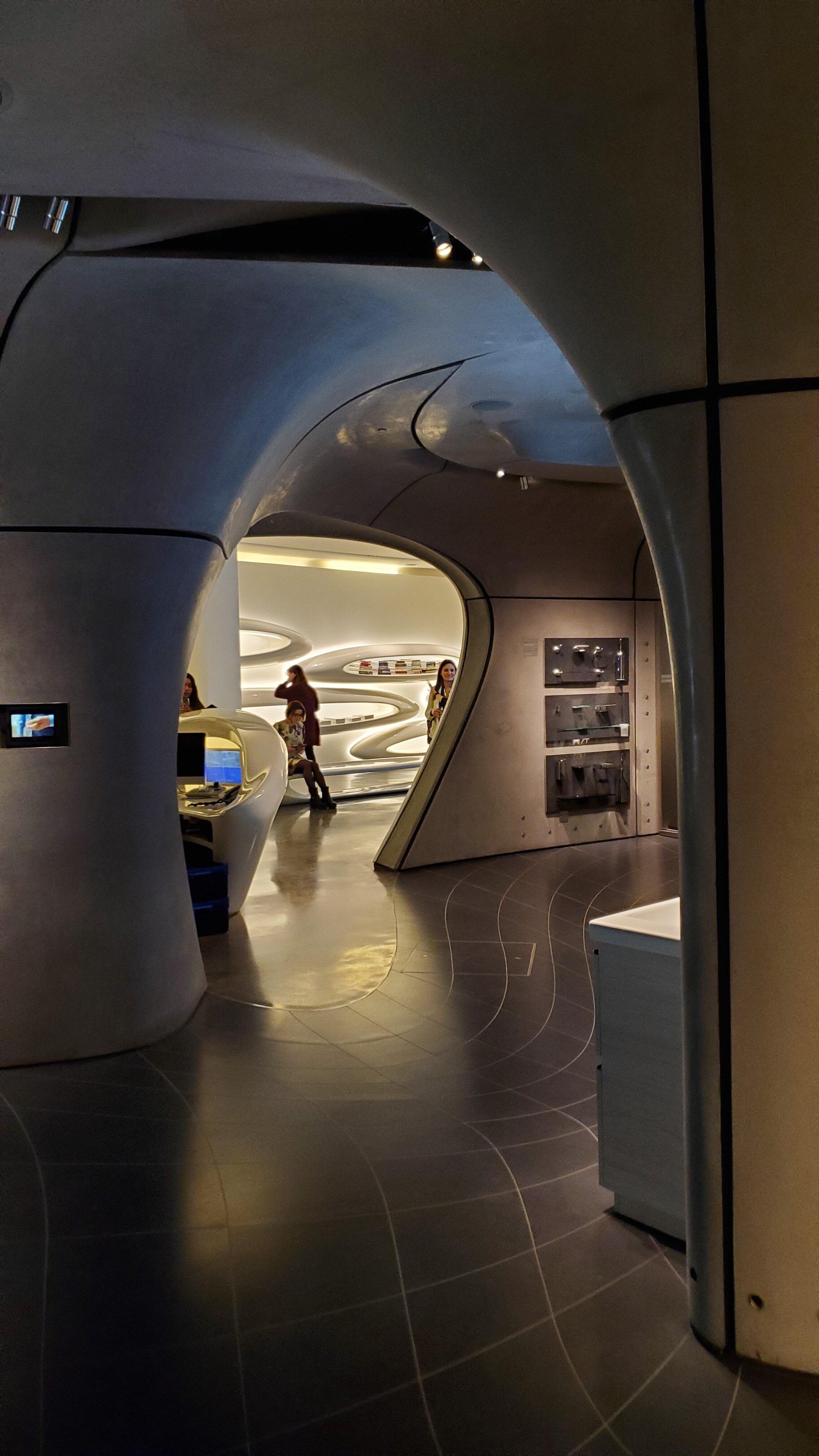
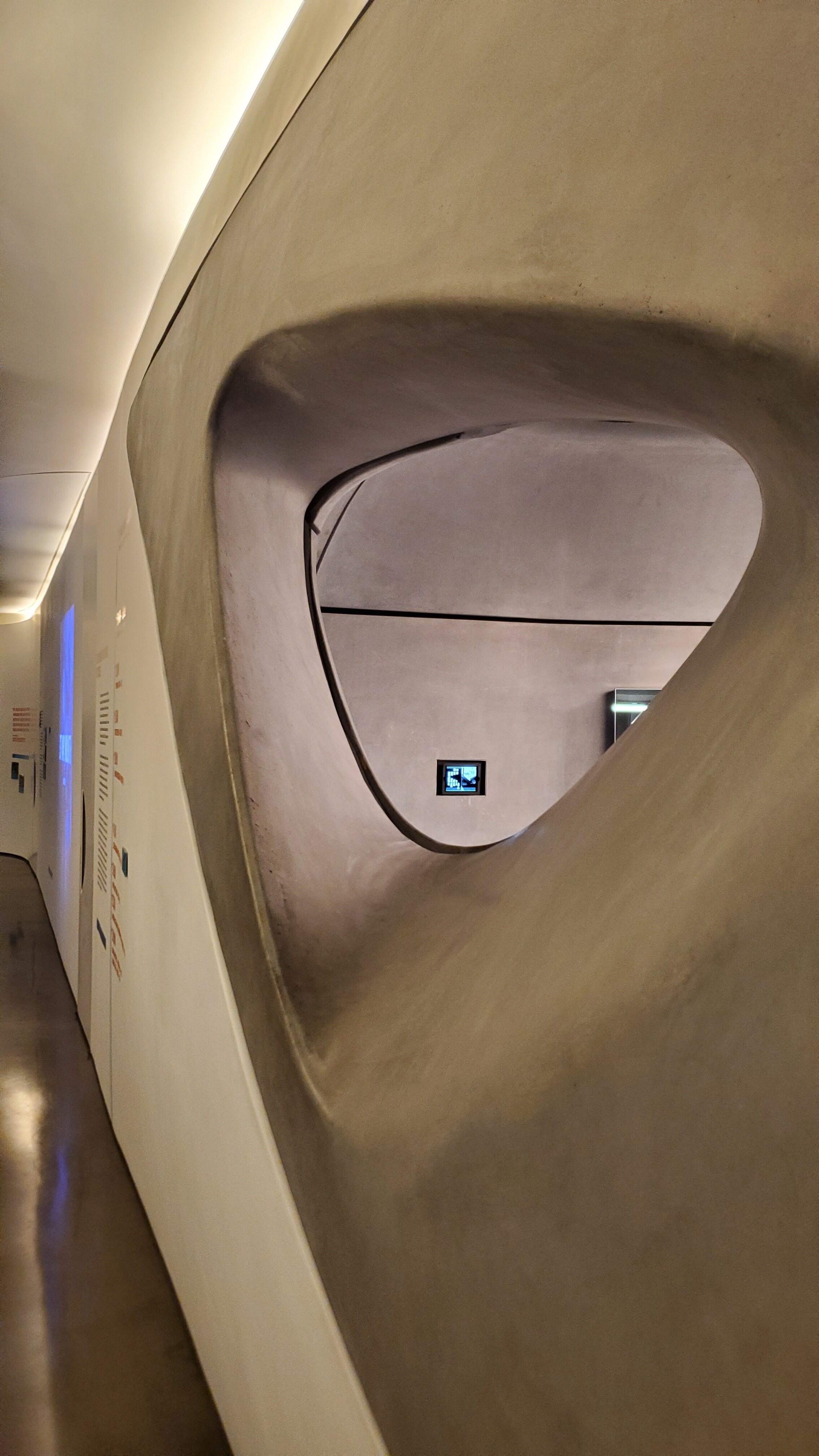
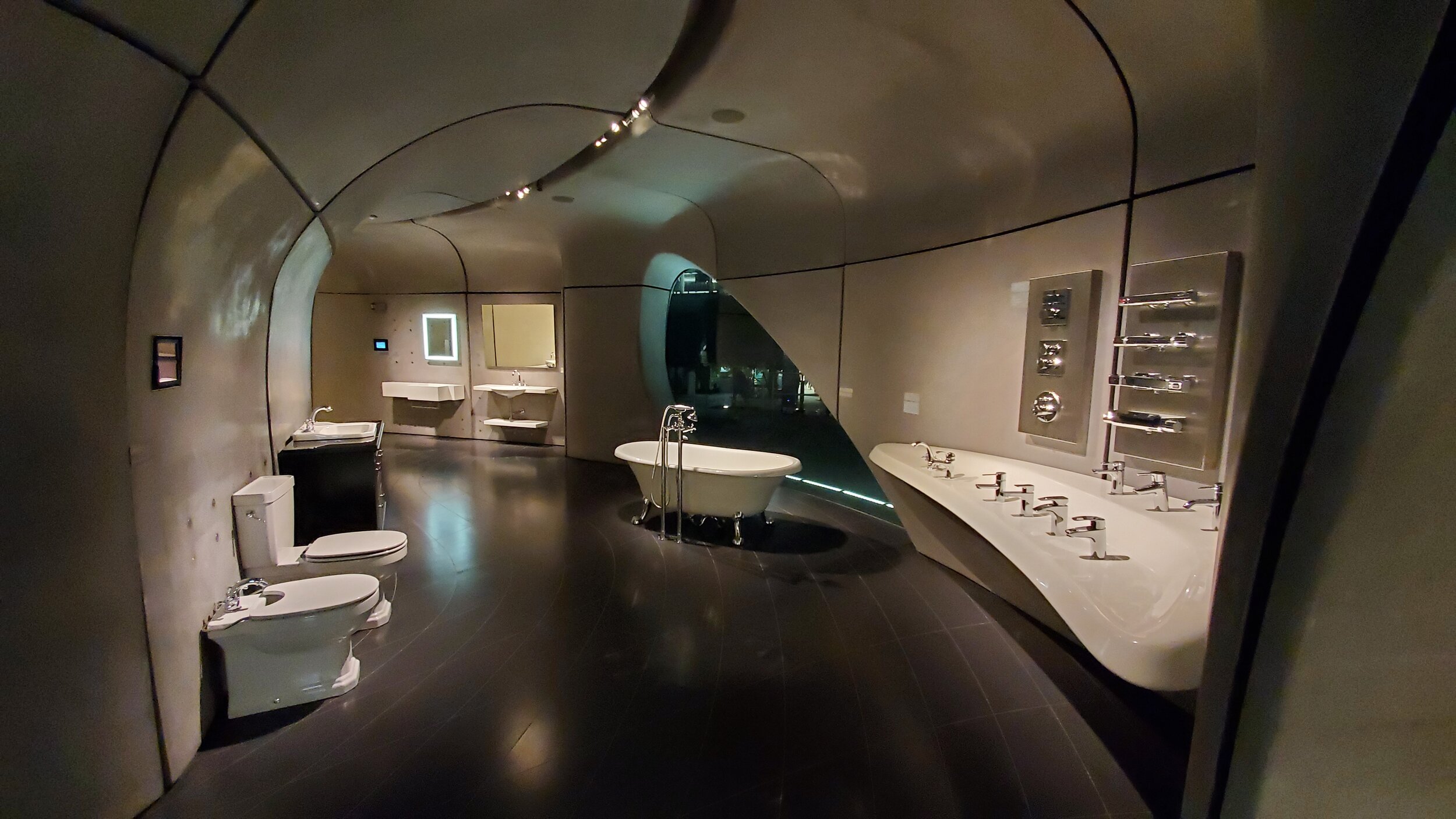
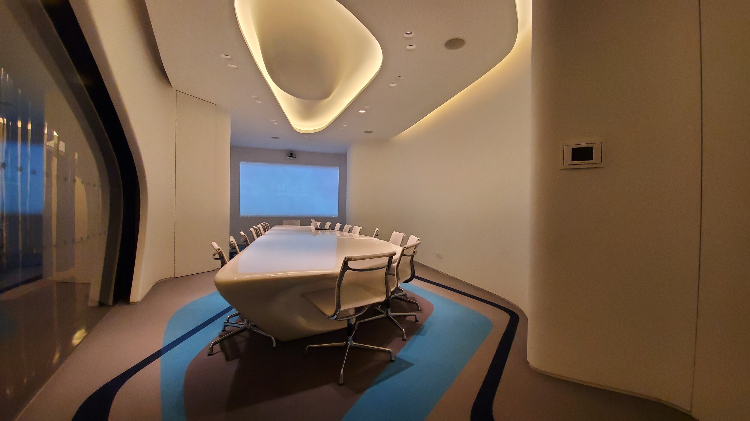
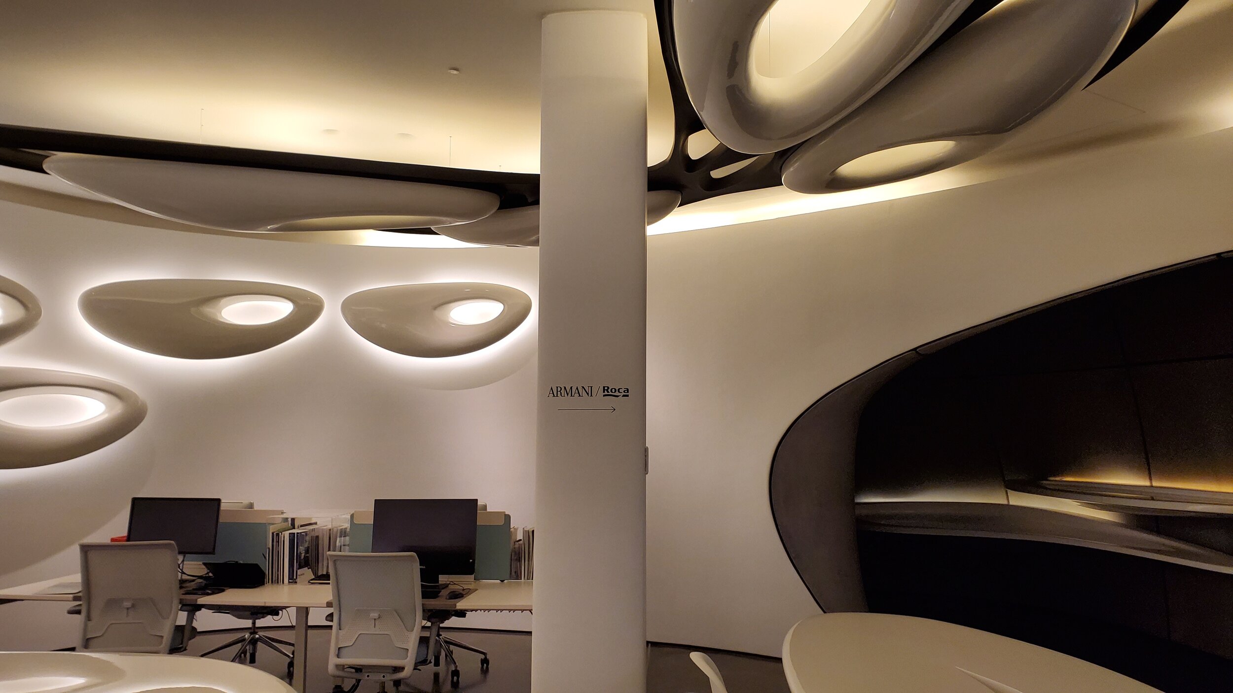
The brief given was simple and open, and Zaha Hadid Architects took this opportunity to experiment with their specialty - organic, dynamic and fluid forms - flowing with the theme of water, each element of the building are bespoke and relates to water. Not a single straight surface! The exterior facade represents the ripples of water, and merges into the interior spaces, the waves follows, the iconic pod lighting highlights the fluid and represents water droplets.

Entering the larger aperture of opening of the facade, you are welcomed by a white space, displaying books and a few pieces of furniture. This is the central axis of the gallery. Surrounding this, are smaller, interconnected spaces that can be viewed through openings in the walls.

20200227_185816.jpg

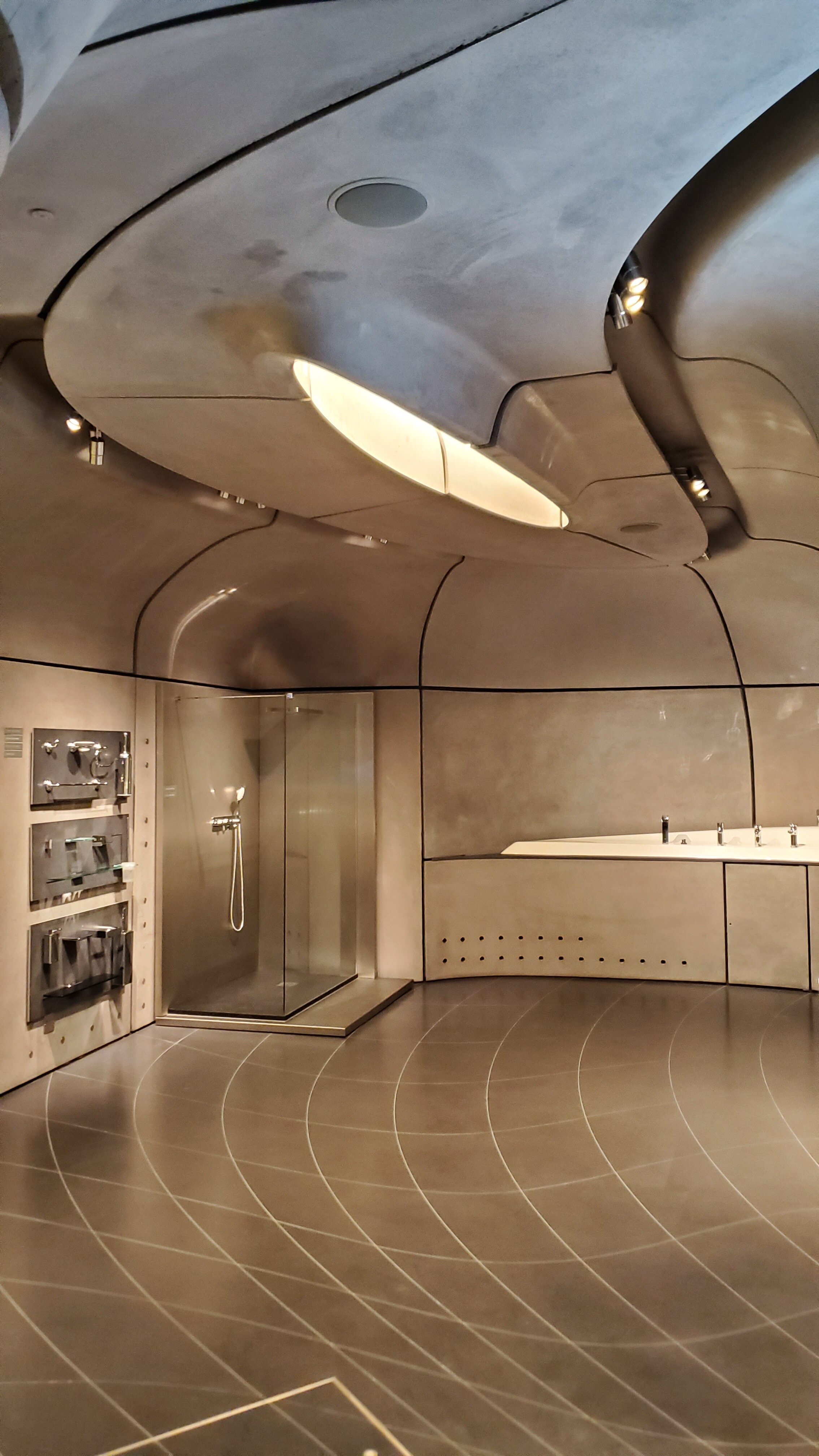
Walking around the gallery, you begin to wonder how these individual sculptural elements are all put together, how a concrete ceiling panel is hung above my head, and is it stable?! Yes, yes it is, each panel is about 400-500kg and has at least 6 cables attached from above or supported by the floor for the lower-level panels, and slotted against each other. The shop’s existing height is 4 meters high, leaving 1 meter for service works, the rest are concrete panels. (There‘s a total of 272 GRC panels installed! 236 interior, and 36 facade panels)

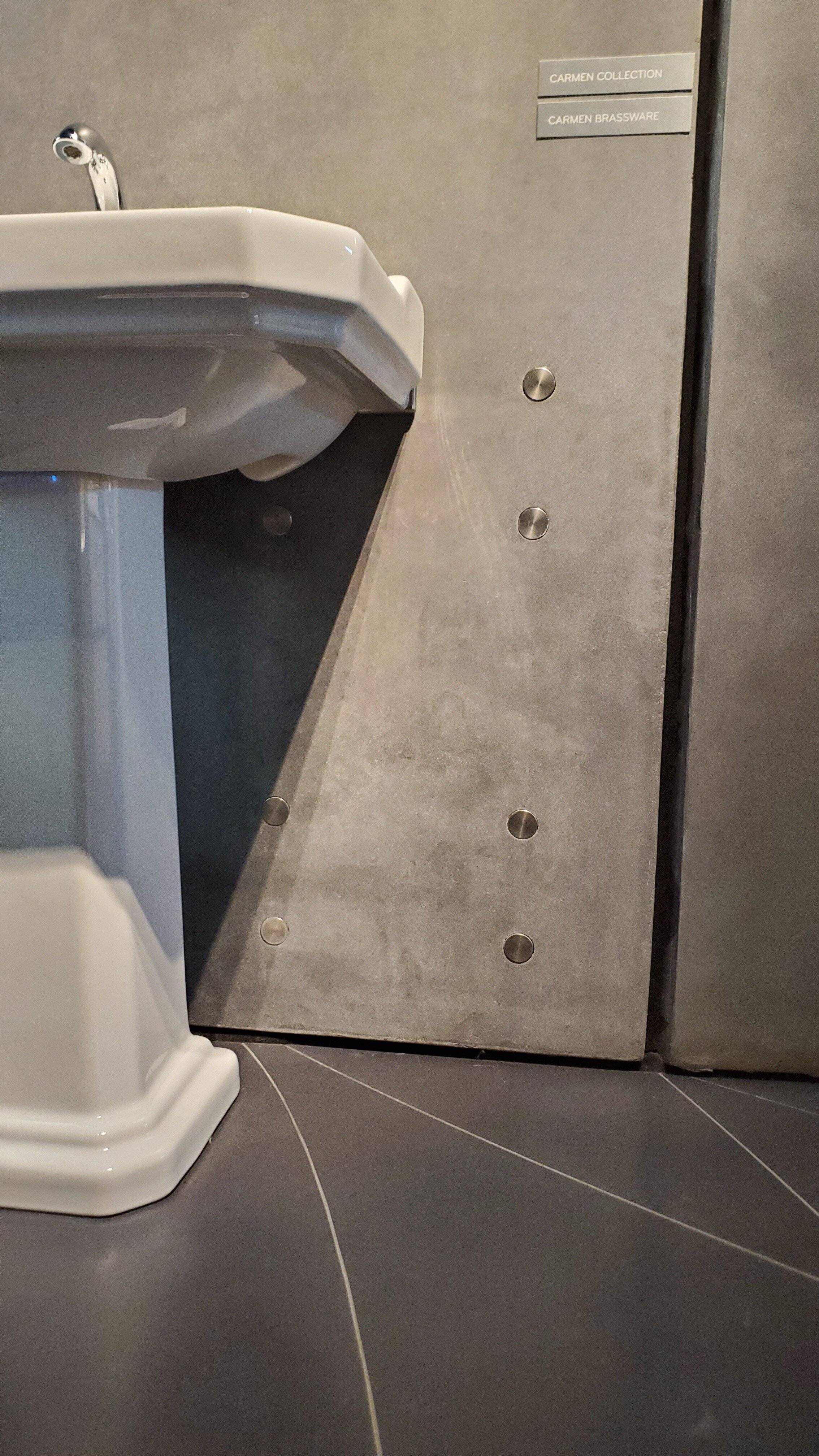
This exposed grey concrete panels are chosen specifically to highlight Roca’s most innovative products, which is also cleverly integrated. How? There are pop up bolts at three different levels on the wall panels so that the products can be hung from it; top level for showers, middle level for basins, and bottom level for the toilets.

20200227_185904.jpg

Given that the project was built between 2009-2011, ZHA was already a master at parametric softwares that aided them in design, however, the manufacturers was still catching up, hence, the team had some trouble to finding the best contractor to build their bespoke pieces. Luckily, in the end, they managed to find a German fabricator to fabricate their concrete, and my-oh-my, to perfection.

As there were no straight edges in this building, there were no possible section or pans that makes sense, the team had to rely on 3D printed models to be printed after each alteration was made. (and this would be on a weekly basis!)

Even the mosaic floor tiles were cut and laid individually, designed as an optical effect inspired by water current, and leads you in and out of the gallery.

Roca Gallery is definitely a place to visit, not only does it house a gallery of Roca’s products, the space is also used to host social and cultural events that are of interest to Roca, including exhibitions produced in-house and externally, meetings, presentations, debates and receptions.

See Roca Gallery’s website for more information about their events and opening times.

The new Bloomberg HQ in BLOOM

Everyone has their duty to protect the environment and sustain the world, and one of the ways that architects has taken action is through designing buildings that are sustainable. We welcome the BLOOMBERG HQ in 2017 which was awarded for the highest BREEAM rating of 99.1% for commercial developments! Let us applaud Foster + Partners for their efforts!! But that’s not all that the building is awarded, it also won the 2018 RIBA Stirling Prize!

The new Bloomberg’s European Headquarters moved from 50 Finsbury Square to 3 Queen Victoria Street, situated across a historic site of 3.2 acres. The complex is made up of two buildings divided by a pedestrianised dining arcade that reinstates Watling Street, an ancient Roman road that once ran through the site. The complex also houses the restored Temple of Mithras in the London Mithraeum. (which is FREE to visit!)

But first of all, let us appreciate the blend of 9,600 tonnes of Derbyshire sandstone with bronze ventilation fins used for the building’s facade, it does not impose itself on the City of the historic buildings that surrounds it, but is sympathetic to its context.

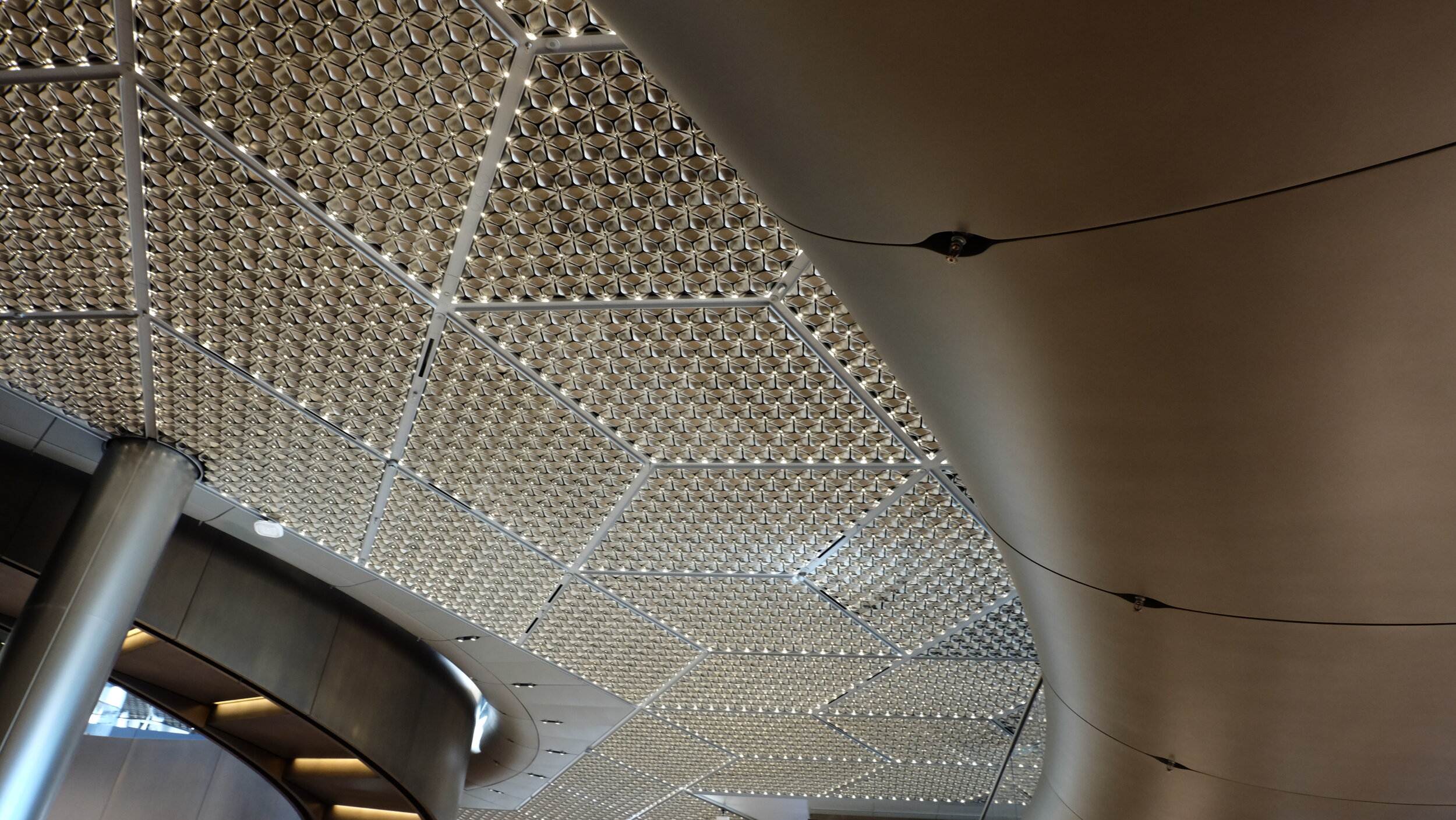
Next, let’s admire the details of the innovative technology Fosters’ has used to reach the outstanding BREEAM status. The secret to reducing 40% less energy is in the bespoke petal-leaf designed ceiling panels. Not only aesthetic, the 500,000 LED lights are eco-friendly; providing better air-ventilation, cooling, heating and acoustics.

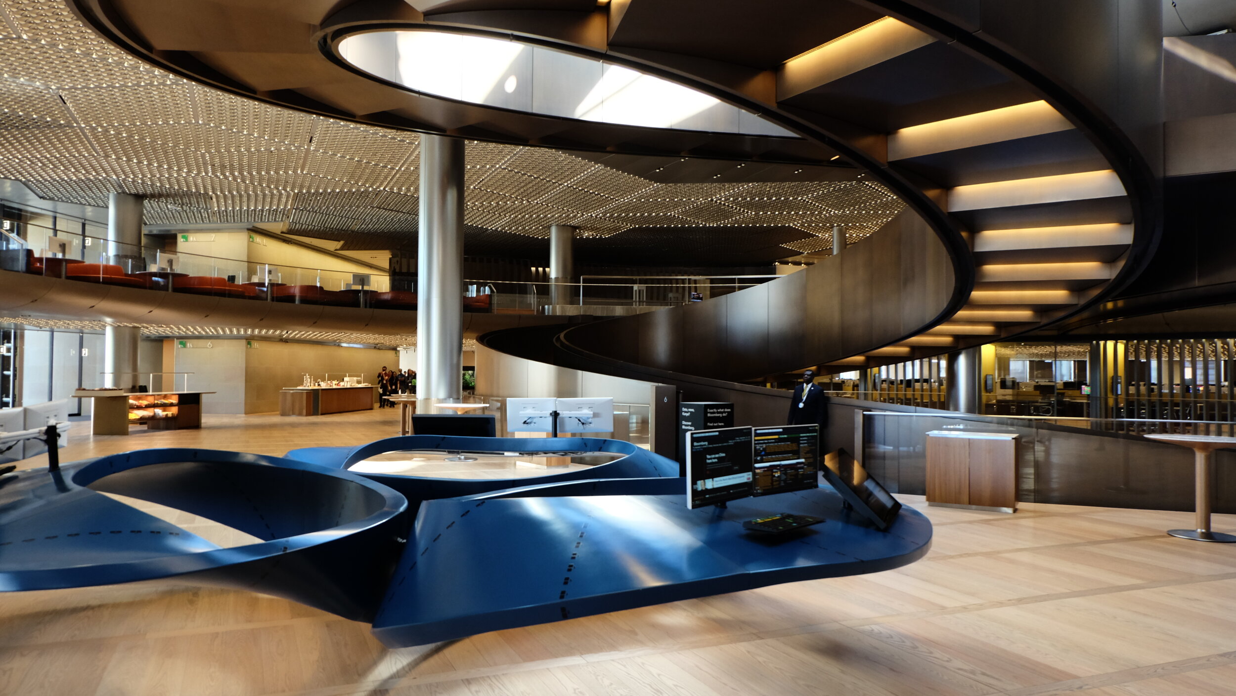
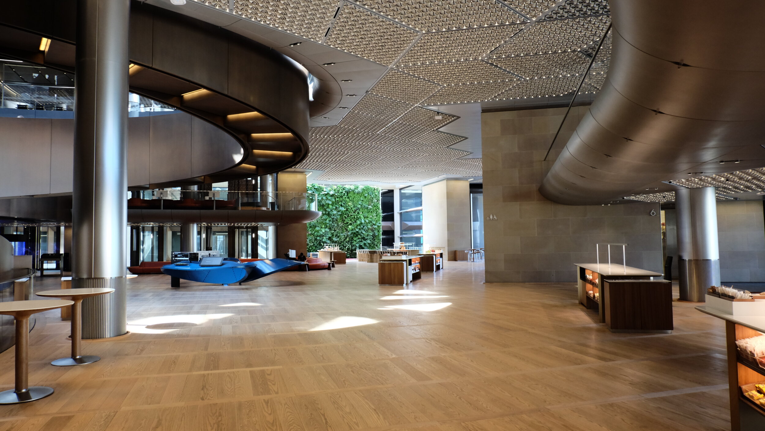
Upon entering this pioneering piece of architecture, we are whirled in by… ‘The Vortex’, the dramatic double-height entrance lobby. The twisted, wood-paneled structure is part hallway, part work of art, and relies on nothing to support its weight! The milled aluminium centre-piece of ‘Vortex’, by Danish artist Olafur Eliasson, is called ‘No future is possible without a past: Wave ceiling’ and acts as both a pond-like floor when viewed from above…

Looking closer at the details on the wooden panels…

Another feature of Bloomberg is the triple helix ramp, spanning over six floors, the ramp leads people seamlessly inside the building, into open-plan office spaces. (Felt like a bit of M.C.Esher’s staircase to me though!) This sculptural staircase visually opens up the entire building, and is designed to inspire and encourage the employees to interact with each other.

“…a spiralling ramp at the heart of the building ensures a connected, healthy and creative environment. 

Lord Norman Foster, Architect of Bloomberg London

Enjoy more of the building from this video from RIBA Architecture…

BREEAM - Building Research Establishment Environmental Assessment Method. This means BREEAM rated developments are more sustainable environments that enhance the well-being of the people who live and work in them, help protect natural resources and make for more attractive property investments.

RIBA Stirling Prize - The RIBA Stirling Prize is judged against a range of criteria including design vision; innovation and originality; capacity to stimulate, engage and delight occupants and visitors; accessibility and sustainability; how fit the building is for its purpose and the level of client satisfaction.

How to optimize the use of ARCHiTRACKER app

ARCHiTRACKER is officially available on the app store(sorry android users, we are still working the android version, but we couldn't hold it in any longer so iOS gets the priority!) 

The app is designed to be simple and easy to understand to use, but we want to be sure that you are REALLY utilizing all the features that we have developed for you. 

So you have ARCHiTRACKER downloaded and are ready to go out to explore London... but where are you now? (Or if you have not downloaded the app yet, please click here)

Step 1: Turn your GPS on to locate your exact location.

Step 2: Under 'Map view', you can see if there are any interesting architectures immediately around you. If you have found one, go to Step 3. If not, go and walk around until you find something! 

Step 3: Click on the pins and you will be directed to the page of that building's information and photographs! It will even show you the directions to get there if you are not close enough!

and that's it! Just three simple steps while you are on the go! 


But of course, the fun doesn't end here, you can plan your day before you even leave the house! Find out which buildings you wish to visit by going into the 'List View' tab, you can view the full exhaustive list of buildings in London! 

When you have found one, click on the image, and it will direct you to the building's information and photographs page. If you are an architect or in the field or just curious, we have conveniently provided links to the Architect's official website, photographer's website, and other consultants that are involved with the project, so then you can view more details about their other projects. 


We hope that you will find ARCHiTRACKER app useful for whatever reason you use it for, be it curious about your city, travelling, architectural inspiration etc etc. We welcome all kinds of feedback and opinions, so please feel free to email us at any time to [email protected], and we will try to respond to all! You can also track our development on the app on our ARCHiTRACKER Roadmap.

Thank you for all your supportive words and love ARCHiTRACKERs! Our team really appreciates your patience, and will continually work hard to develop and tailor the app to your best concerns! 

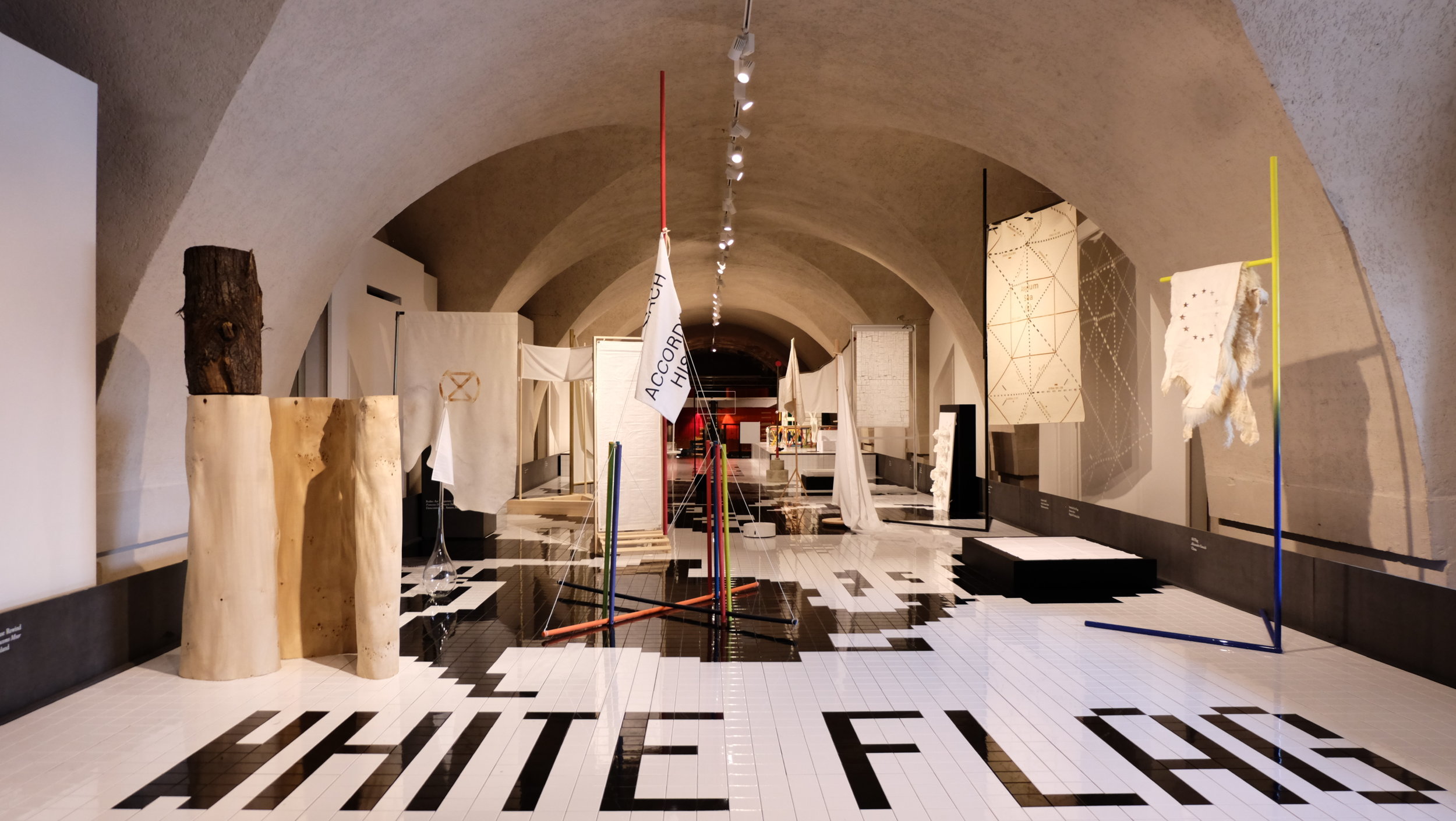
London's first Design Biennale has descended upon us

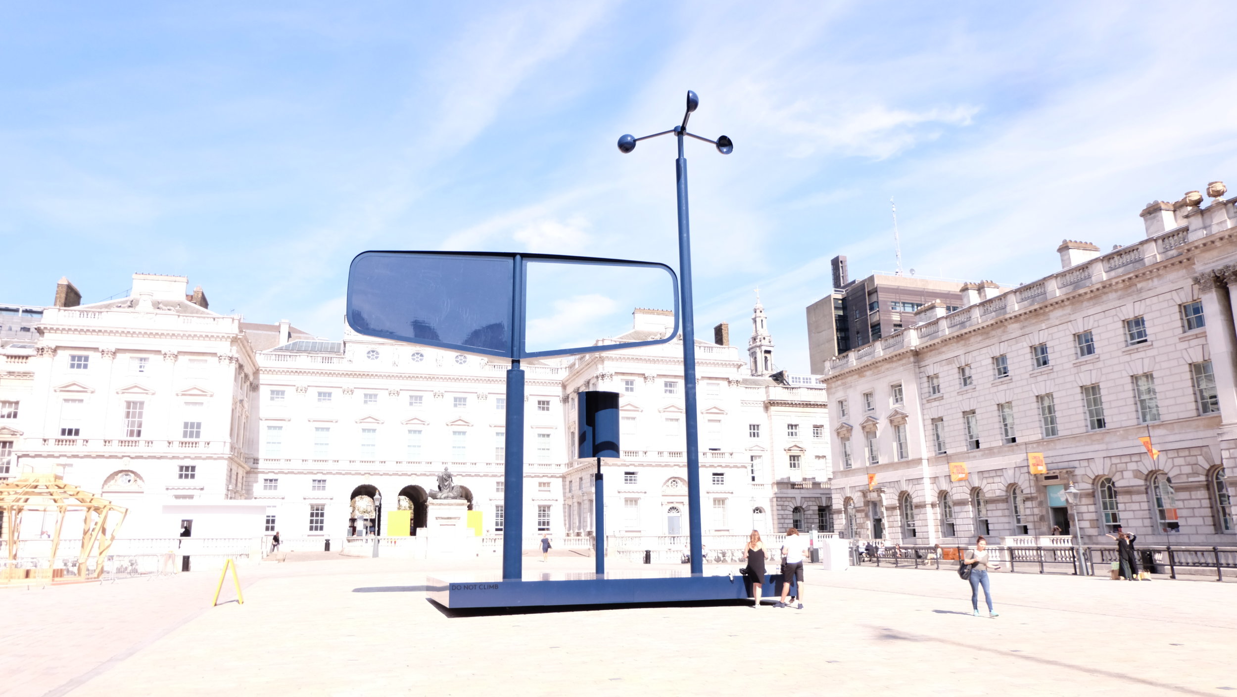
We have waited, and waited long enough! The Design Biennale has finally arrived in central London in a mere three week period during September 2016, in the Neoclassical Somerset House by the River Thames.
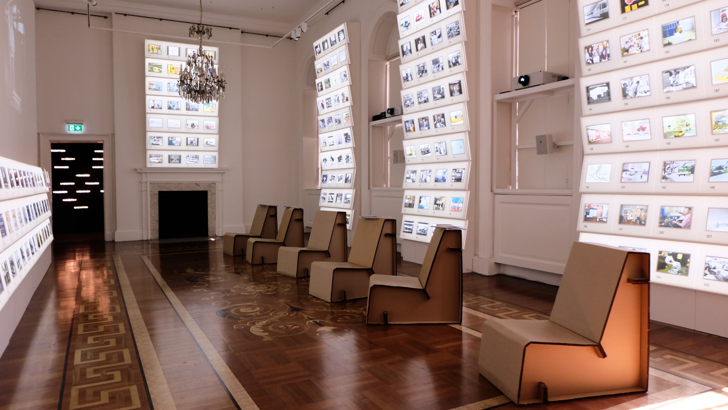
London Design Biennale held at Somerset House this year

London Design Biennale held at Somerset House this year

To mark this commemorative moment, 37 countries have responded in various engaging exhibitions and installations to the theme ‘Utopia by Design’ chosen by the director Dr. Christopher Turner, to celebrate the 500th anniversary of the inspirational publication of Sir Thomas More’s Utopia.

So what is so significant about More’s Utopia you ask? It is a neologism meaning both ‘good place’ and ‘no place’, it is a fictitious island with 54 near identical cities that are described as a triumph of design. A perfect world that does not exist, but provokes the mind to envision a dream.

India's colourful 'Chakraview'

India's colourful 'Chakraview'

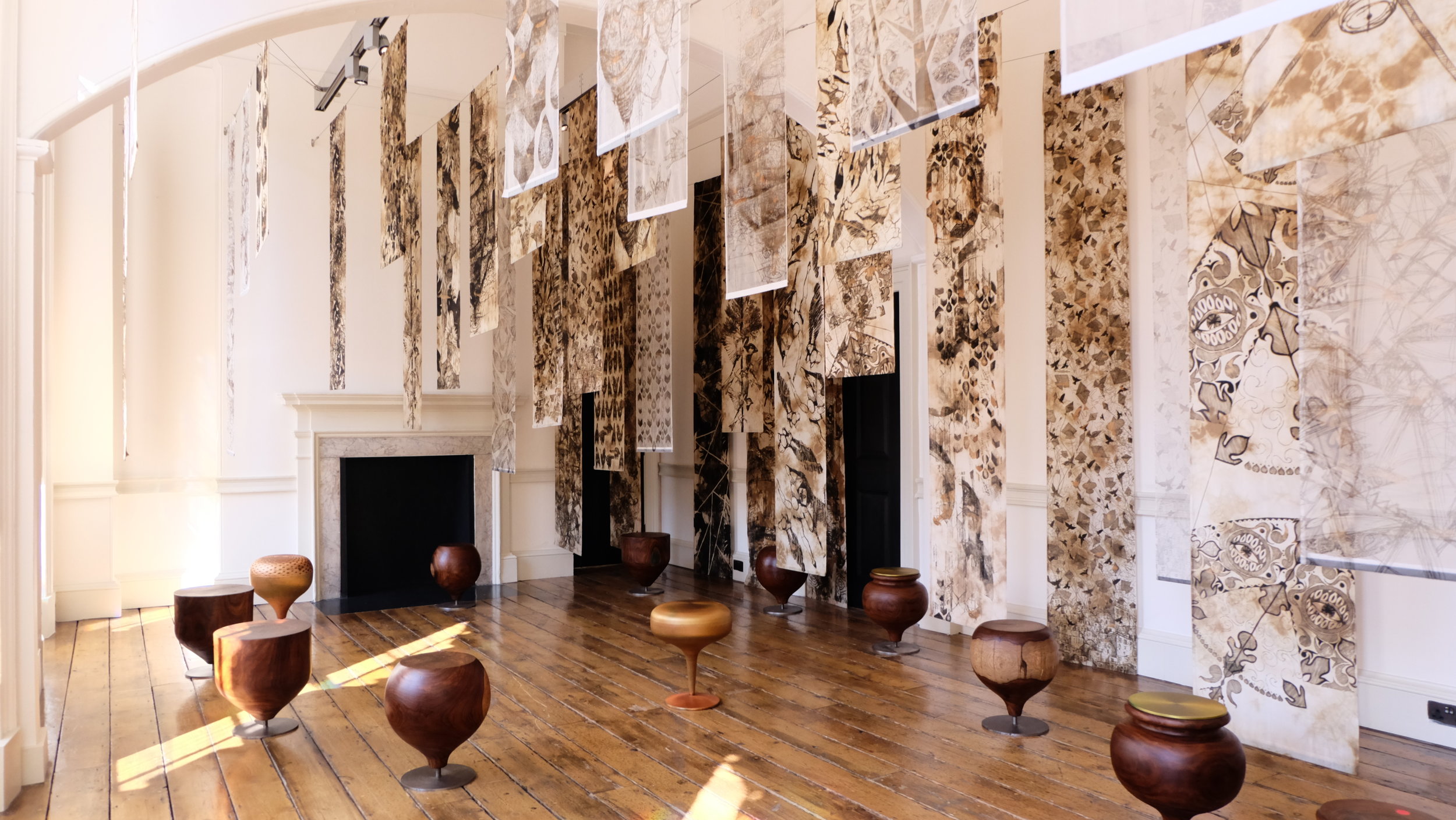
There were several impressive installations that caught our attention, to name a few that transported you into another part of the world were India’s ‘Chakraview’, which envelops you in a range of colourful contemporary textiles using traditional weaving methods in circular disks.

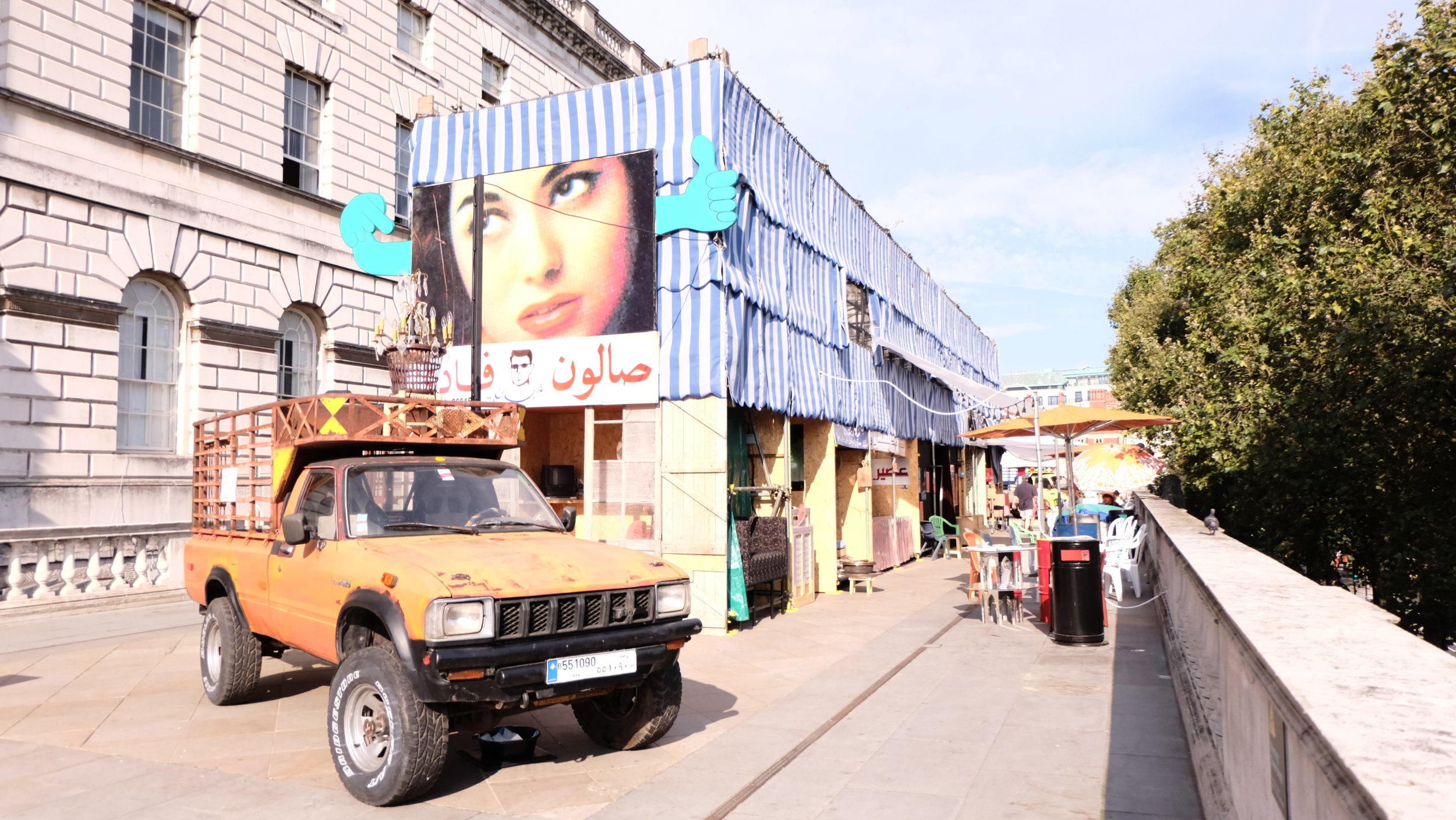
Stepping outside by the River Thames, you are as close to Lebanon’s bustling street life in Bierut as you can get in London, with a small lounge cinema, to a wet shave at the barber shop, smoke a Shisha to authentic falafel wraps and fresh juices. Definitely an atmospheric place to take a break from all the walking around!
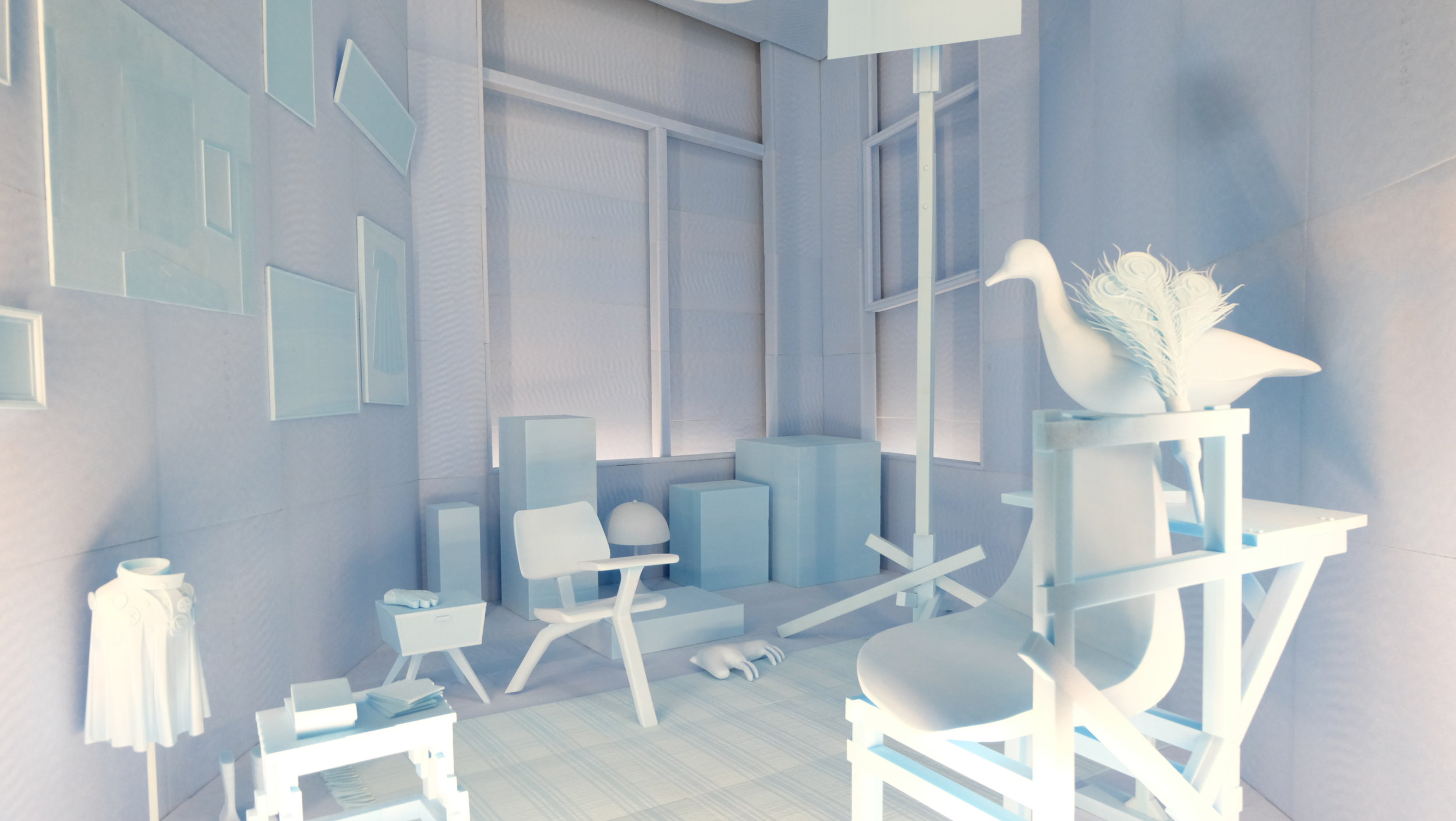
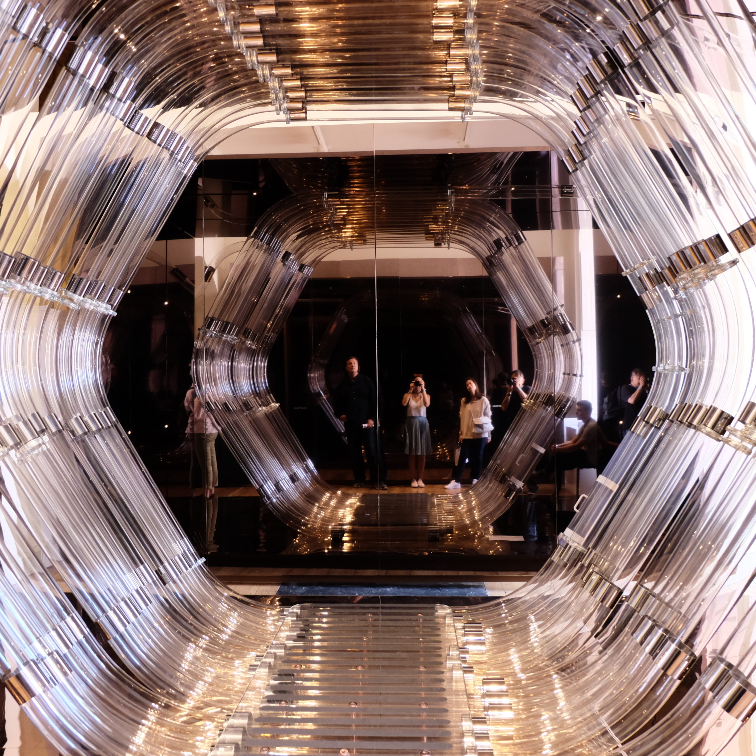
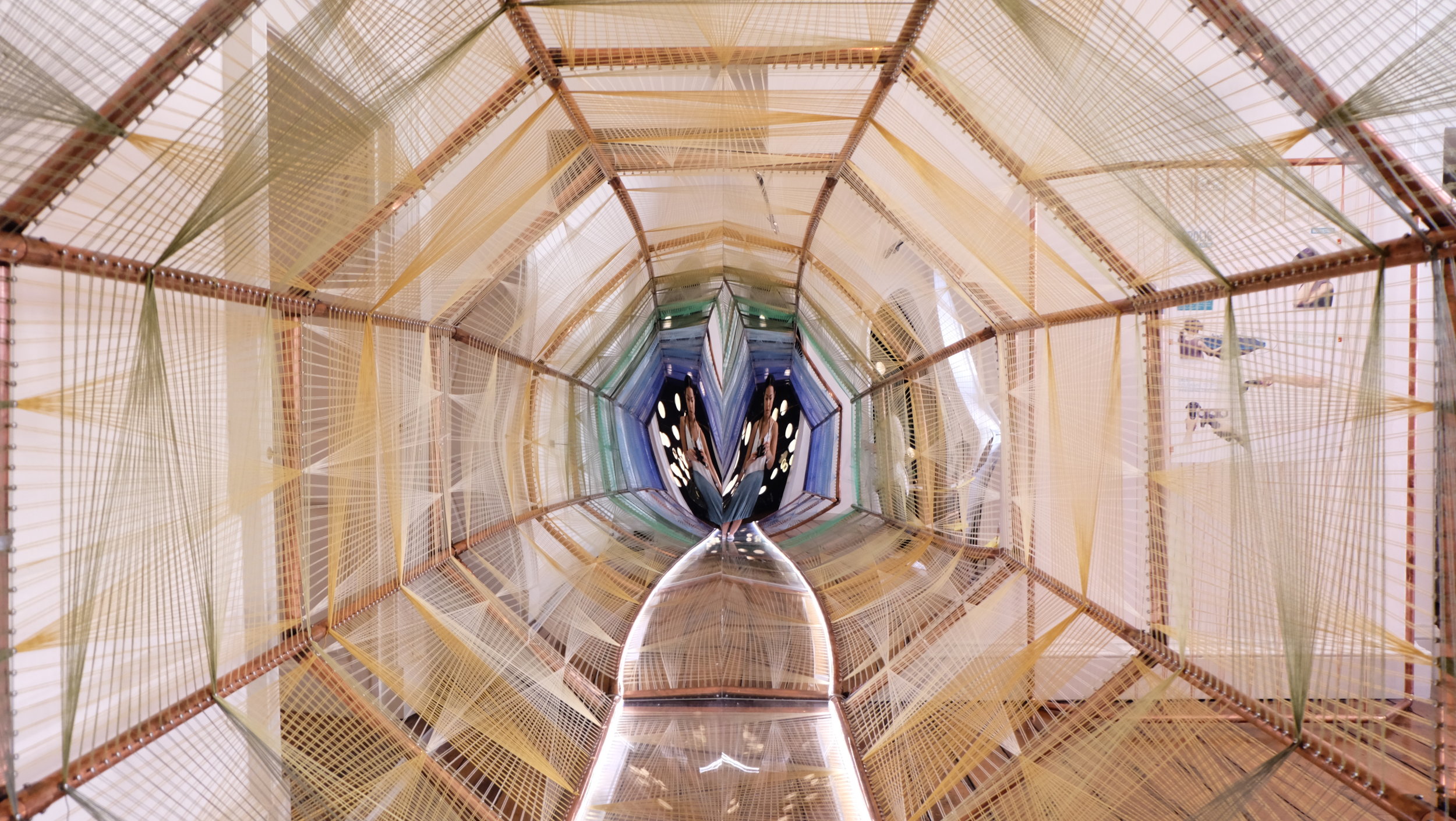
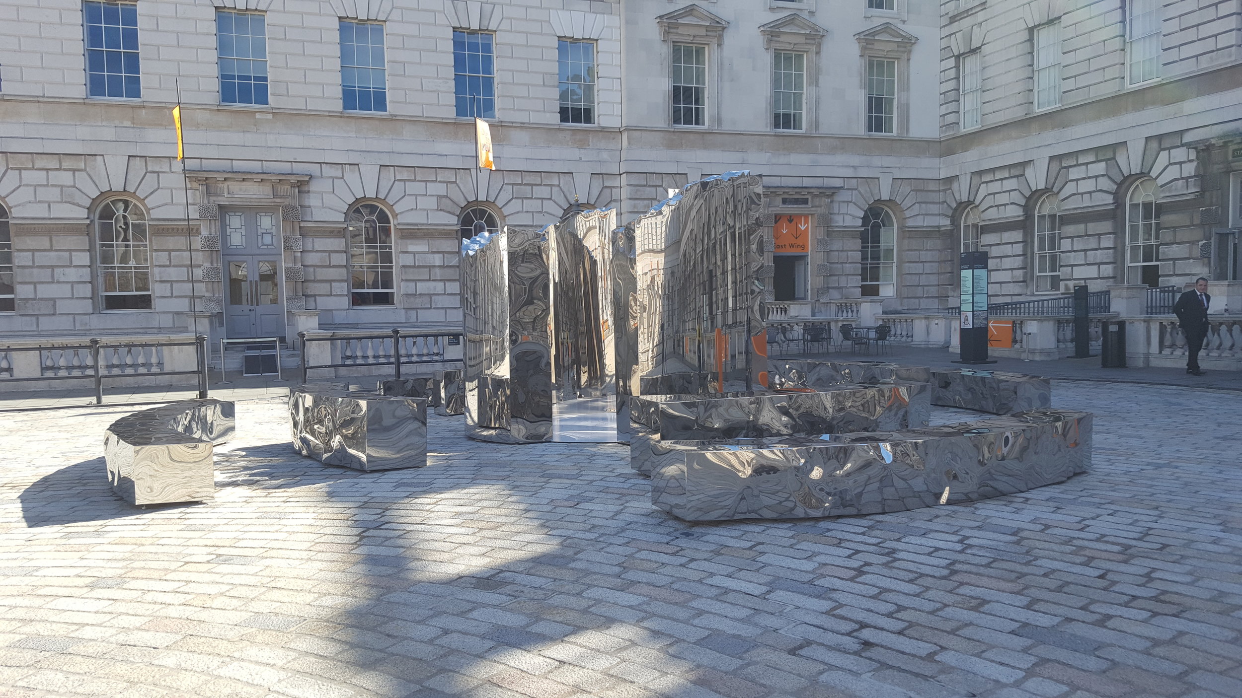
Turkey creates an eternal space of mirrors where ‘The Wish Machine’ will transport your hopes, wishes, visions of utopia and aspirations of the future vacuumed around the building and into the unknown.

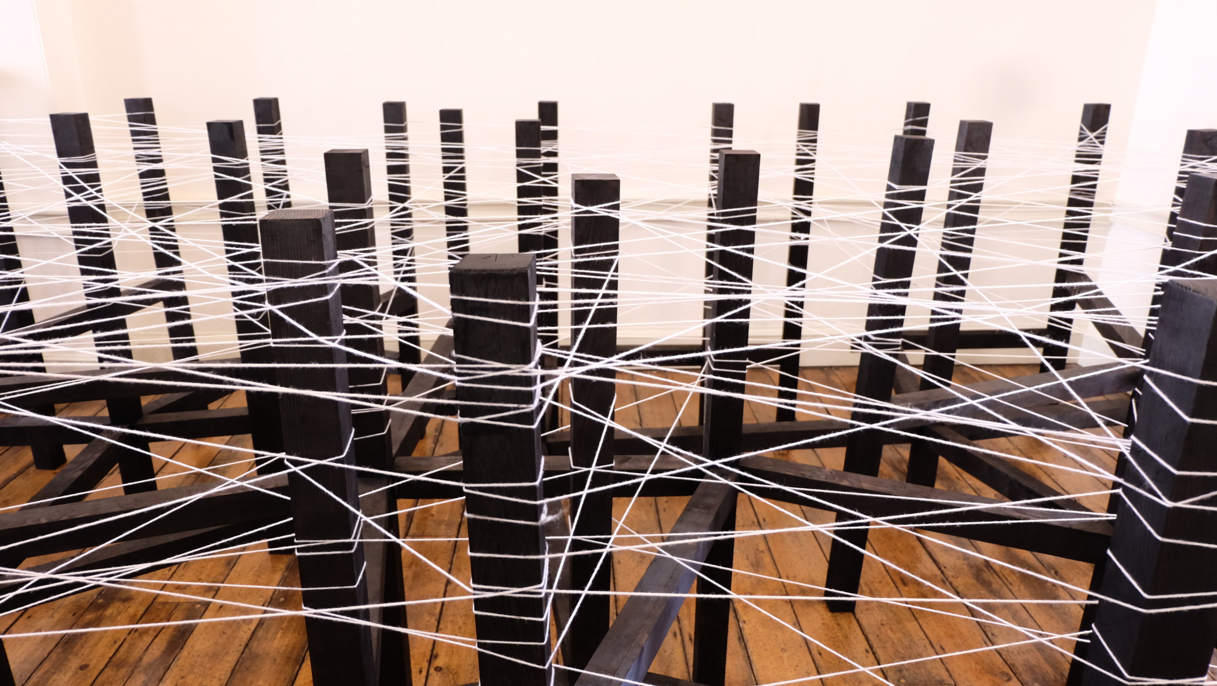
Just as Austria realizes that Utopia is an impossible ideal, installing an interactive 'LeveL' kinetic light sculpture that will dim at the slightest movement created by the visitor passing through.

With new advanced virtual-reality technology, Spain had us dive into the future 100 years from now using the ‘VR Polis’, exploring a smart-city of a sustainable urban-living, allowing us to interact and discover the possible strategies for the future.

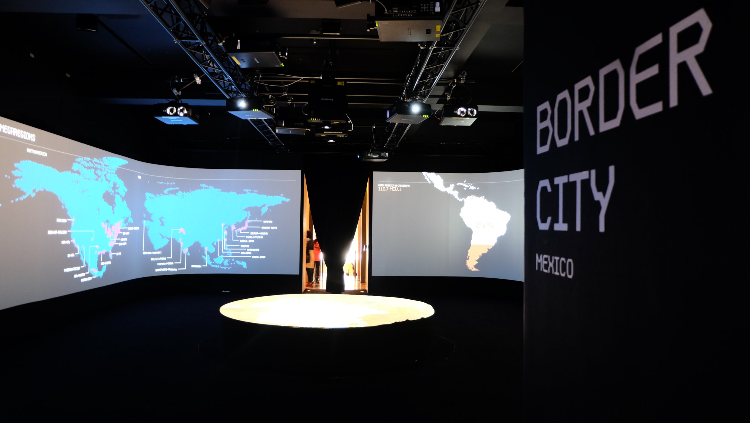
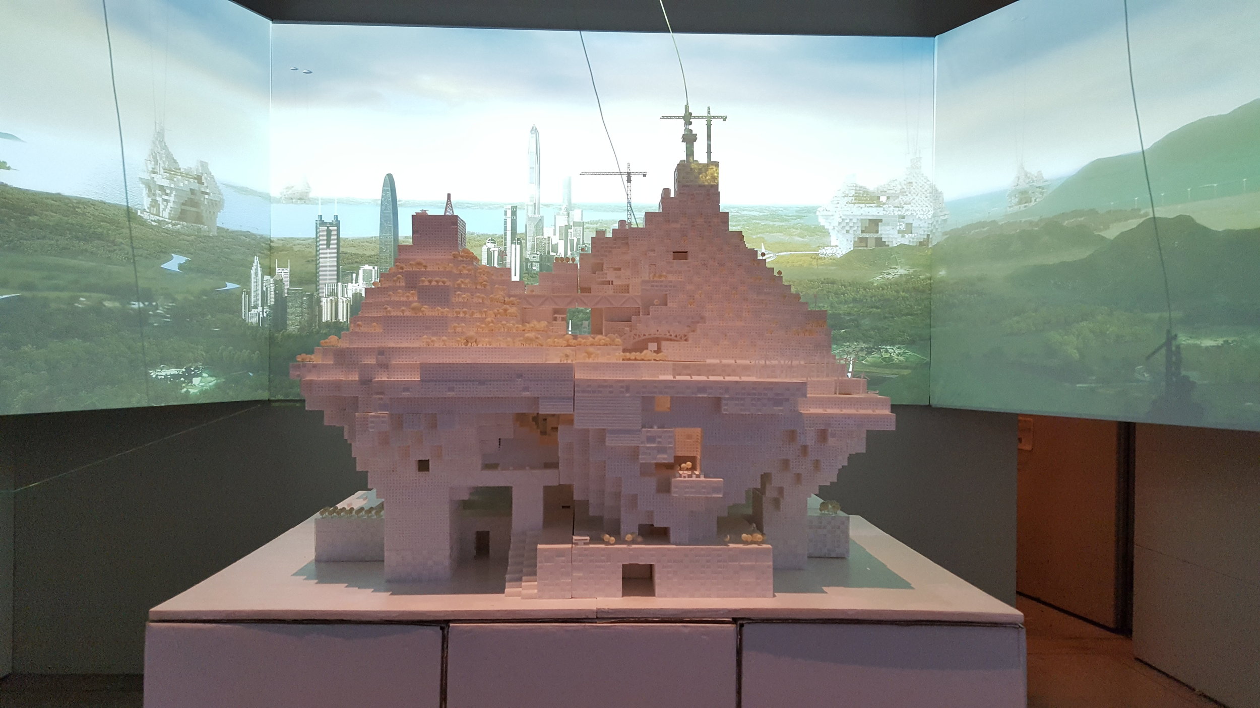
On a more concerning issue, Mexico proposes a ‘Border City’ as it proposes an ambitious solution to emigration, production and population growth. By building an adaptable system for this bi-national city, expressed in the form of a large-scale model, enhanced with video mapping and audio-visual effects.
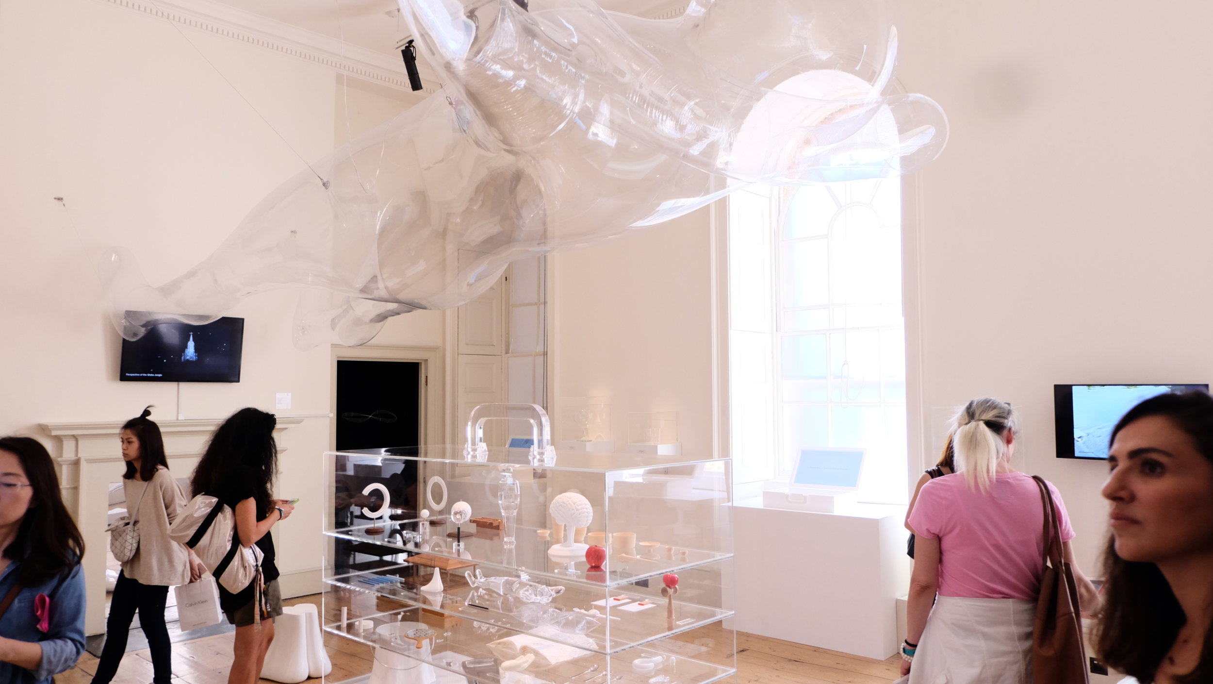
In the child’s utopia (or the inner child in us), South Africa has designed several hanging ferocious animal mobiles that is ludicrously inviting as you want to snuggle into the cosy, soft fur in the mouths of these animals. They are handcrafted by locals; expressing traditions, craft and heritage.
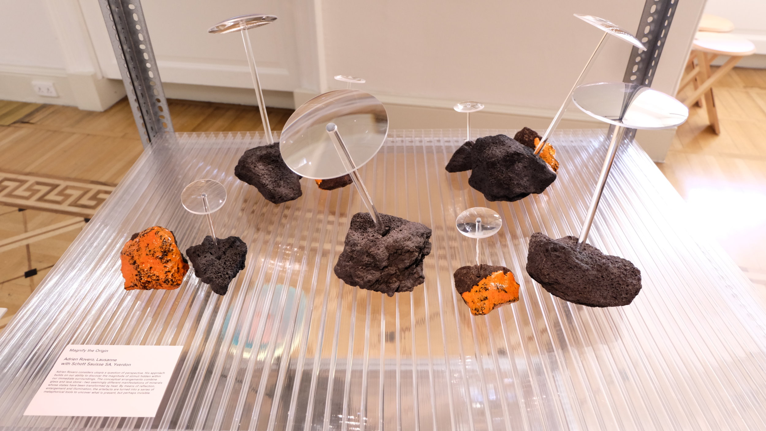
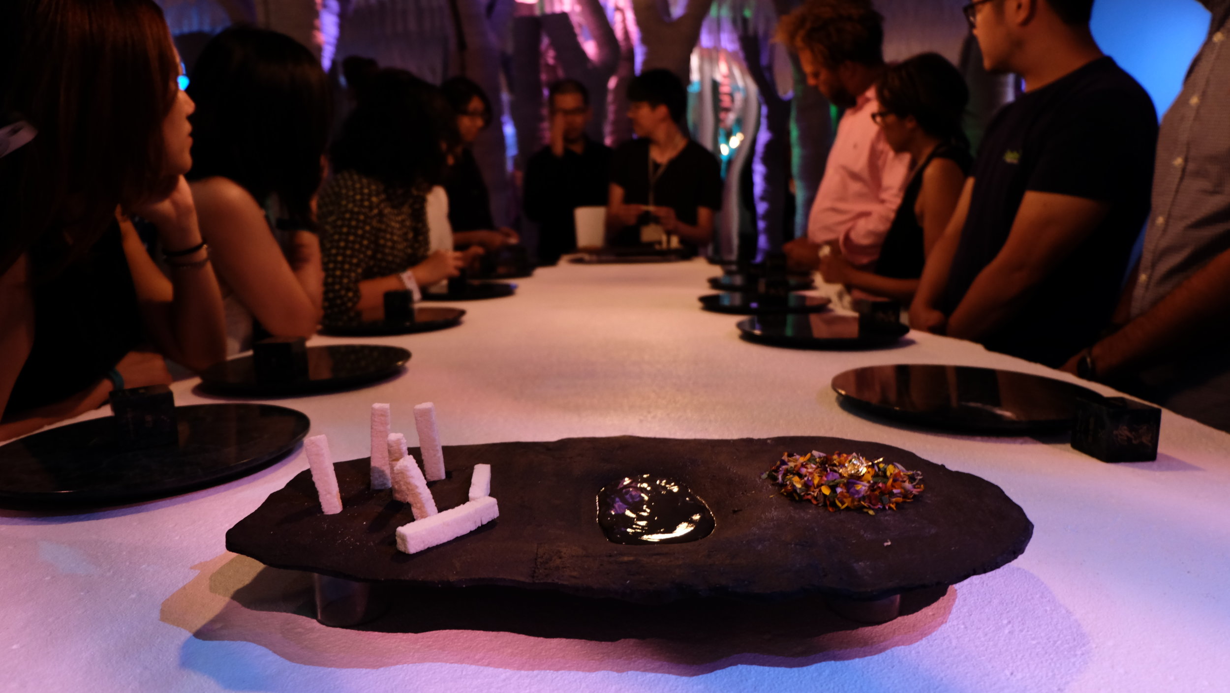
For some others, ‘Eatopia’ might have won some hearts over, food, is always something that brings people together, Taiwan brings a unique culinary experience that explores its contemporary culture through beautifully curated dishes to amuse your taste-buds.

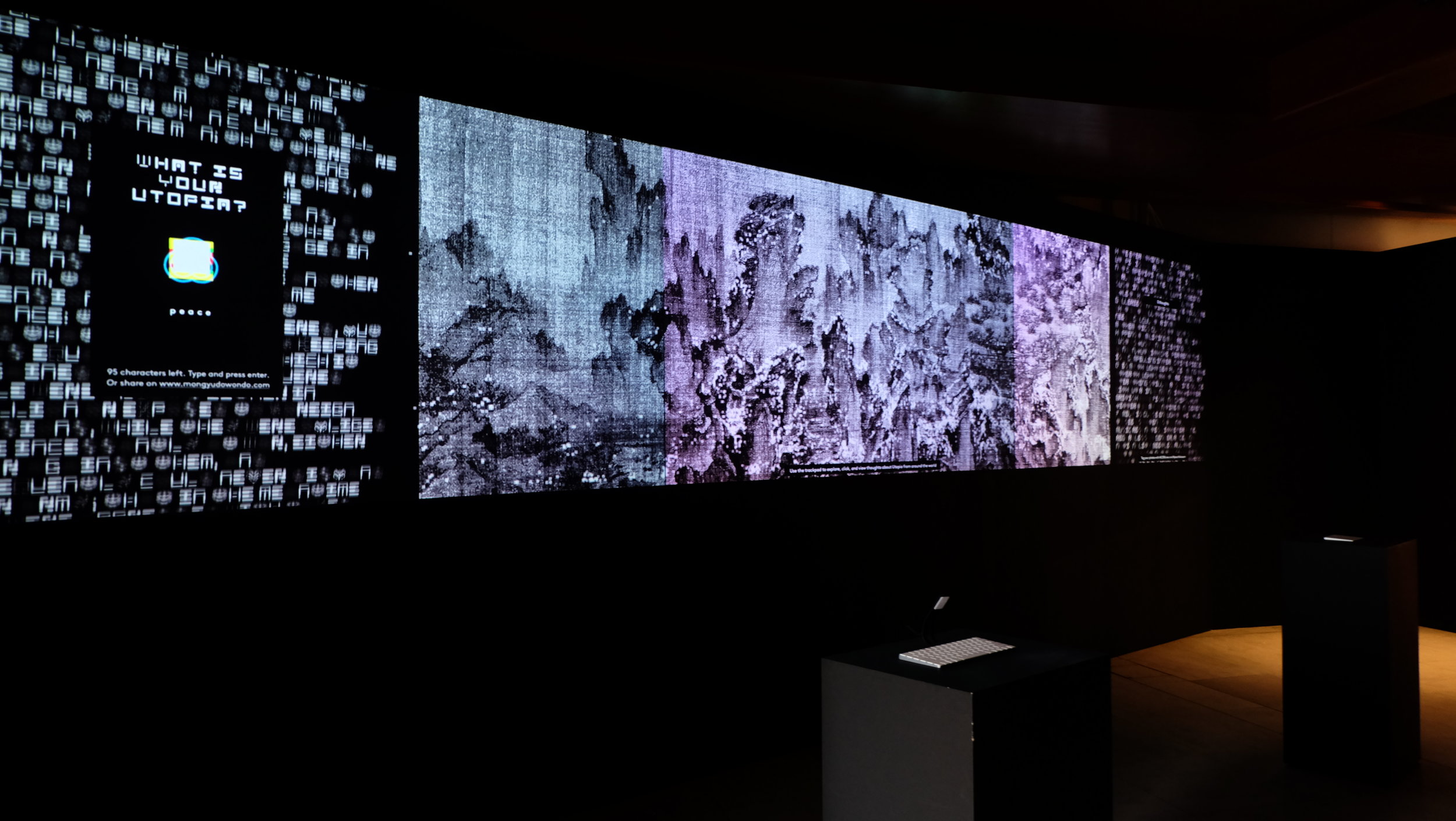
Somerset House actually homes a permanent exhibition in the ‘Utopia Treasury’, which includes a library of Utopian themed literature. Talks were also held in this area where each of the countries had a presentation on their outtake of Utopia. So if you’ve missed the ‘Utopia by Design’, make sure you visit here instead!

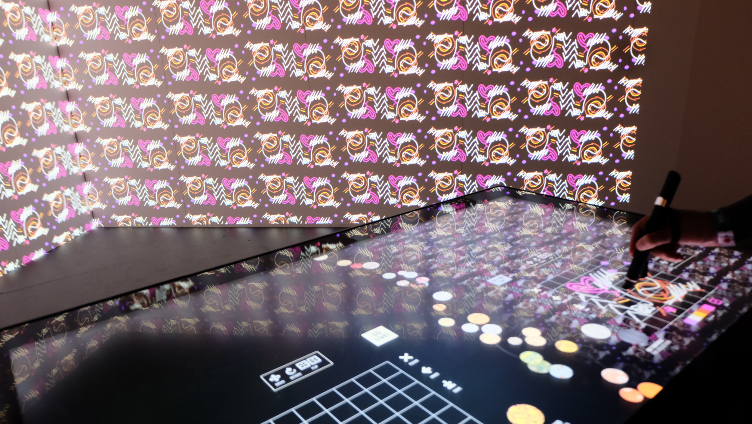
The 'design your Utopia' corner by visitors in the Utopian Treasury

The 'design your Utopia' corner by visitors in the Utopian Treasury

By the end of the day, you are most likely to have enjoyed being overwhelmed by all these intriguing and inspiring exhibits, it leads you hoping that some of these ideas can really put us a step closer to Utopia, and possibly solve the current problems in migration, pollution, sustainability, cities and social equality. Now, we shall just patiently wait for the next Biennale in two years’ time and let it continue to inspire us as designers.

Participating countries include: Albania, Australia, Austria, Belgium, Chile, Shenzhen, Croatia, Cuba, France, Germany, Greece, India, Indonesia, Israel, Italy, Japan, Republic of Korea, Lebanon, Mexico, Netherlands, Nigeria, Norway, Pakistan, Poland, Portugal, Russia, Saudi Arabia, South Africa, Spain, Sweden, Switzerland, Taiwan, Tunisia, Turkey, United Kingdom, United Arab Emirates, United States of America.

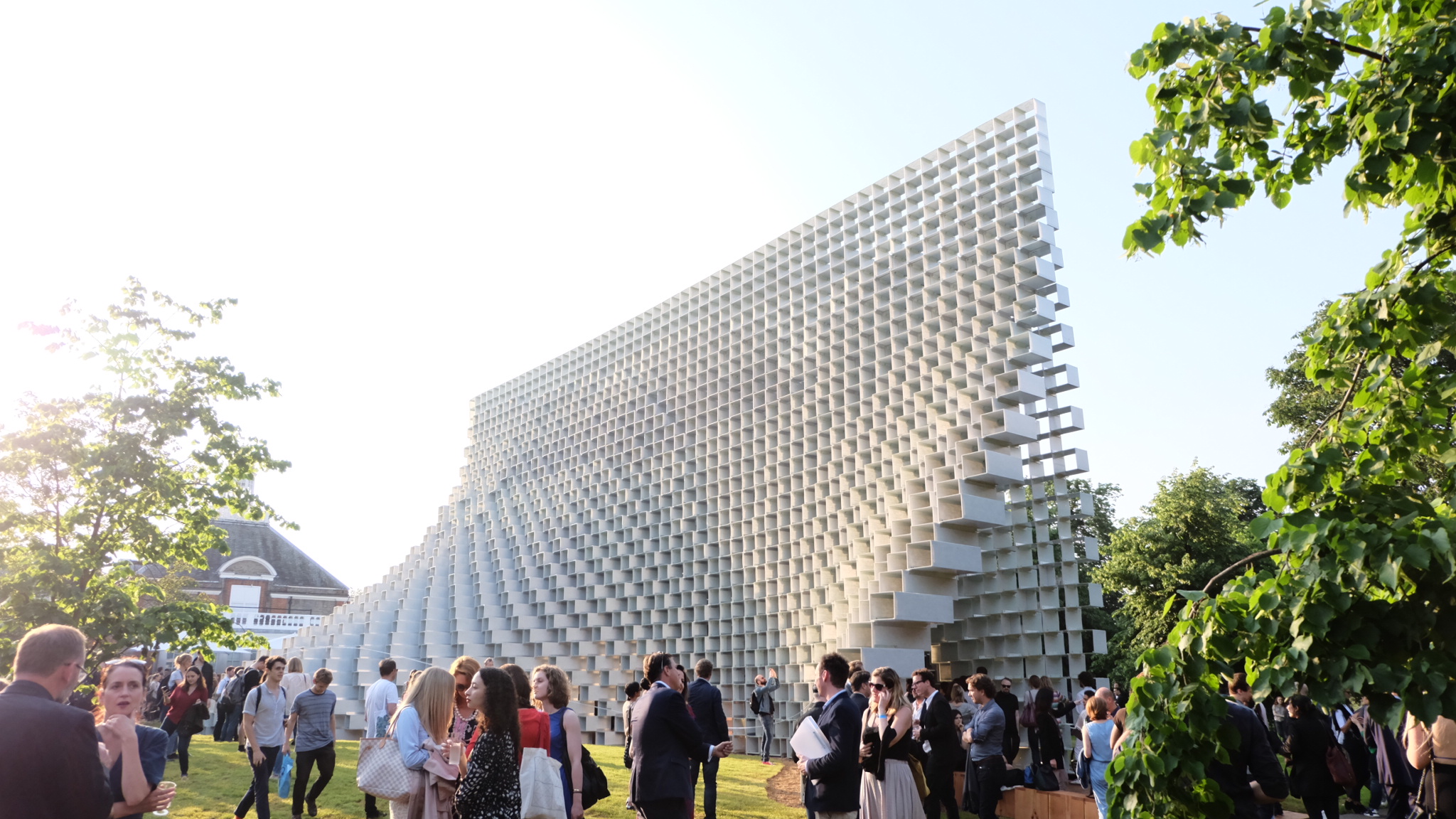
The Serpentine Pavilion 2016 / Bjarke Ingels Group (BIG)

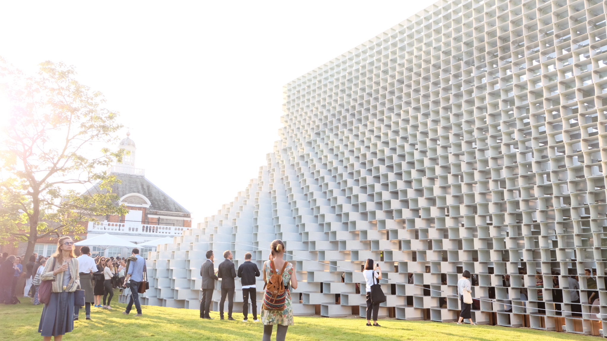
This year's Serpentine Gallery Pavilion designed by the Danish architect firm, Bjarke Ingels Group (BIG), featuring a tall pointed structure made of interlocking fibreglass bricks. A series of box-like fibreglass frames stacked on top of each other in a pattern based on a common brick wall.

"We have attempted to design a structure that embodies multiple aspects that are often perceived as opposites: a structure that is free-form yet rigorous, modular yet sculptural, both transparent and opaque, both solid box and blob," said Ingels.

The Serpentine Gallery Pavilion 2016 will stay open throughout the summer until 9 October 2016. 

Bring you packed lunch, a bottle of wine, hang out there on the sunny days --- Good summer plan, isn't it?